This talk summarises a significant piece of research and data analysis that I have conducted to understand the how airborne wind energy compares with wind turbine generation in consistency of power output.
I wanted to understand the impact that wind speed fluctuations have on wind power generation for current and future off-shore UK wind farms, and the impact this then has on achieving assured renewable power generation.
I suspected that AWE may be able to show significant benefits and I want to quantify this and to understand what this may mean for energy security. Ultimately, I want to encourage governments to more seriously consider AWE as part of the solution to deliver assured renewable generation and to therefore encourage funding for AWE research and development.
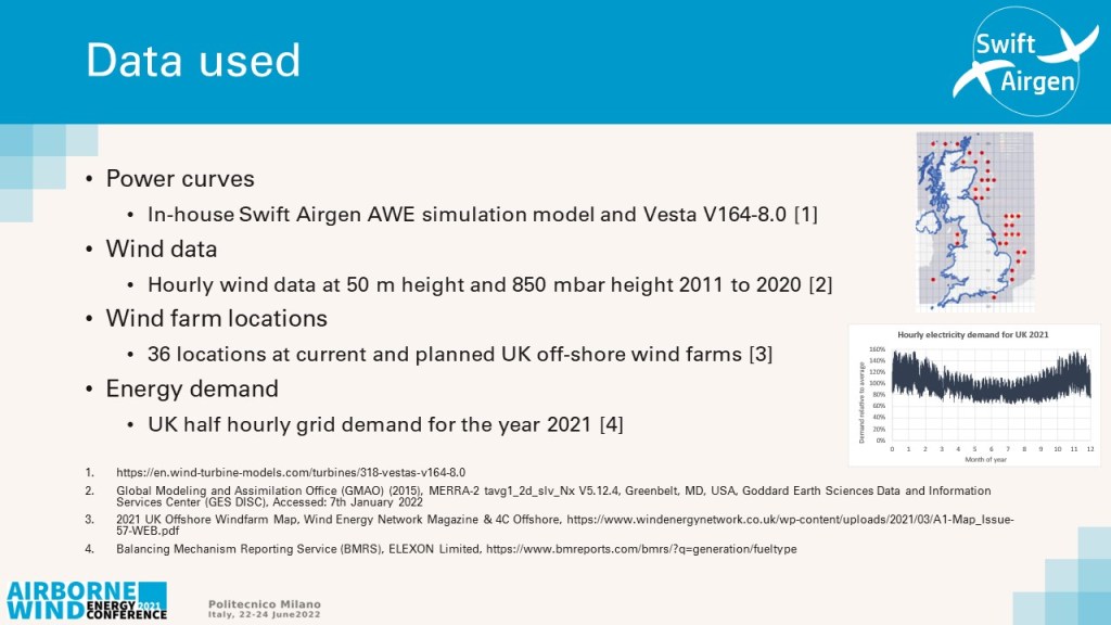
I used 4 key sources of data:
1) Of critical importance are the power curves that I used, that define how the power output varies with wind speed. I will discuss this in a later slide;
2) For wind data I downloaded hourly measurements from the MERRA data set from the Global Modeling and Assimilation Office in the US. I used hourly measured wind speeds for 50 m height and at the height of 850 mbar pressure;
3) I based the work on the off-shore UK wind farm locations selecting 36 locations around the UK at the approximate locations of current and future wind farms, shown by the red dots on the map. For my analysis each location carried equal weighting;
4) For energy demand I used the half hourly national electric demand for the UK for 2021 as reported by the Balancing Mechanism Reporting Service, shown here on the right.

First, I wanted to understand the nature of the wind over this period and set of locations, but in the context of harnessing wind energy. I used a typical wind turbine power curve, shown here, for a Vesta 8MW system with a cut-on around 3 m/s and reaching a maximum at 12 m/s.
The right charts show the hourly minimum, maximum and average power generation over the 10-year period and the 36 locations, calculated as a fraction of nameplate power. There are two important results here:
1) There is significant spatial correlation over the 36 locations – this means that as the wind speed falls in one location it is likely to fall in other locations. This is particularly so for longer time periods;
2) There is a long-term temporal correlation. There are clear annual fluctuations but there are periods lasting days or weeks where generation is persistently low.
An example of this is in the spring of 2018. There was a 2-month period where wind speeds were very low across all of the 36 sites around the UK.
You can also see here the distribution of wind speeds for this dataset. It shows a peak at just under 8 m/s where the output power from wind turbines is typically around 35 – 40% of the maximum.
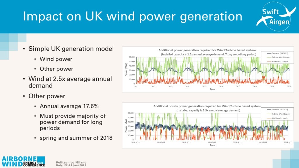
So, what does this mean for wind power in the UK? For this analysis I have imagined the scenario where the UK supply is primarily from off-shore wind with only a small remainder from other sources, and only when not provided by wind.
The charts here show 3 things: 1) the demand as the black line through the centre, this is for 2021 replicated for all years; 2) The green line is the power from wind and; 3) the red line is power required from other sources. Whilst these charts have been smoothed to make them easier to read, the calculations were all performed at 1-hour intervals. I chose a wind turbine nameplate installation factor of 2.5 times the average annual demand as this provided a good compromise to achieve a majority generation from wind.
At this installation rate nearly 18 % of the annual demand would still need to be supplied by other sources.
Importantly one can see that there are times where this other (non-wind source) must supply the majority of the power for the UK, as shown in the lower plot for spring of 2018.
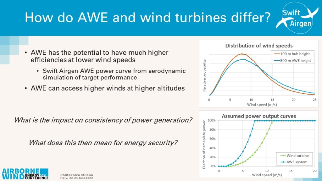
So, how might the power from airborne wind energy be different?
The are two key areas, the first is that AWE typically operates at higher altitude and the top chart shows the difference of wind speed distribution between a 100 m hub height (red line) (typical for a horizontal axis wind turbine) and a 500 m airborne wind energy average height (blue line).
The second and much more significant difference is the power curve that I have used for airborne wind energy. I am aware that other research assumes power curves that are similar to those of wind turbines. However, I believe AWE systems can be designed specifically to provide higher efficiencies at lower speeds and this curve shown is from a detailed simulation model of a Swift Airgen AWE system design.
One can ask the question – “if an AWE system could be designed to provide this performance characteristic, what would the impact be on the consistency of power generation?”
What would this then mean for a nation’s renewable generation and its energy security?
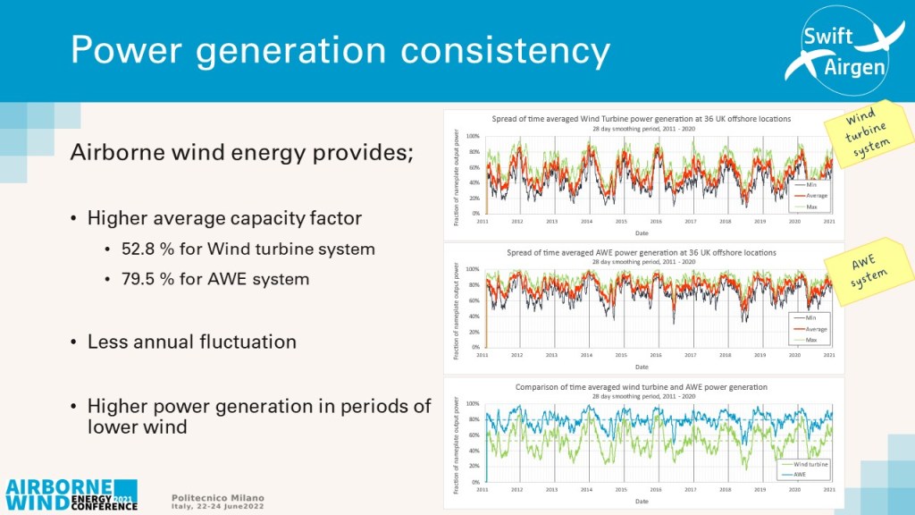
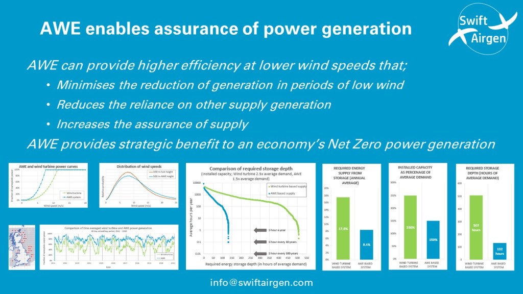
These curves show the wind power output (as a fraction of nameplate maximum capacity) and compare wind turbines with airborne wind energy. One can see a number of differences:
1) The overall average output power is higher for airborne wind energy with an annual average capacity factor of 79.5% versus 52.8 % for wind turbines;
2) The annual fluctuations are less severe with a smaller reduction in the summer;
3) Importantly the depth of more short-term fluctuations (those lasting days and weeks) is much less severe.
The lower chart directly compares the average generation of the wind turbine-based system (green) with the AWE based system (blue).
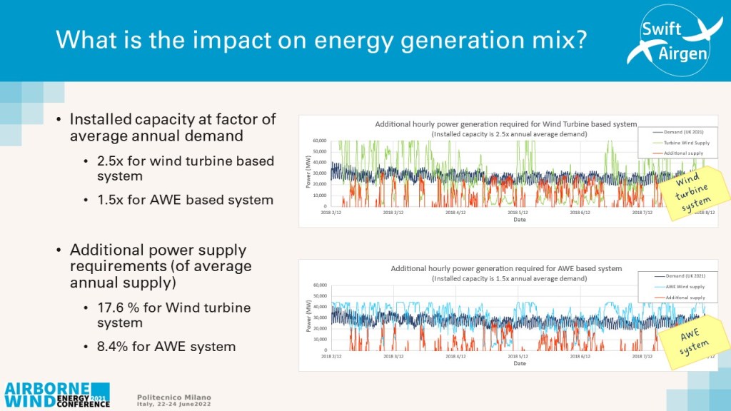
These curves now show the impact that this energy generation has on energy supply. For simplicity I again show only wind generation and other ‘additional supply’ (that must make up any short fall from wind).
For the wind turbine-based system I have chosen an installed capacity of 2.5x the average annual demand, and for the airborne wind energy system an installed capacity of only 1.5x demand. The curves here are for the period in spring 2018 where there was a prolonged period of low wind.
The red line shows the supply required from the additional supply system. As before the calculations were done on an hourly basis but are smoothed in the charts to make the charts easier to read.
One can see that the average demand from the additional supply system is less for airborne wind energy, in fact on average over the 10-year period, it must supply only 8.4% of the total demand versus the 17.6% for wind turbines.
However, whilst this looks very favourable for airborne wind energy it does not tell the whole picture.
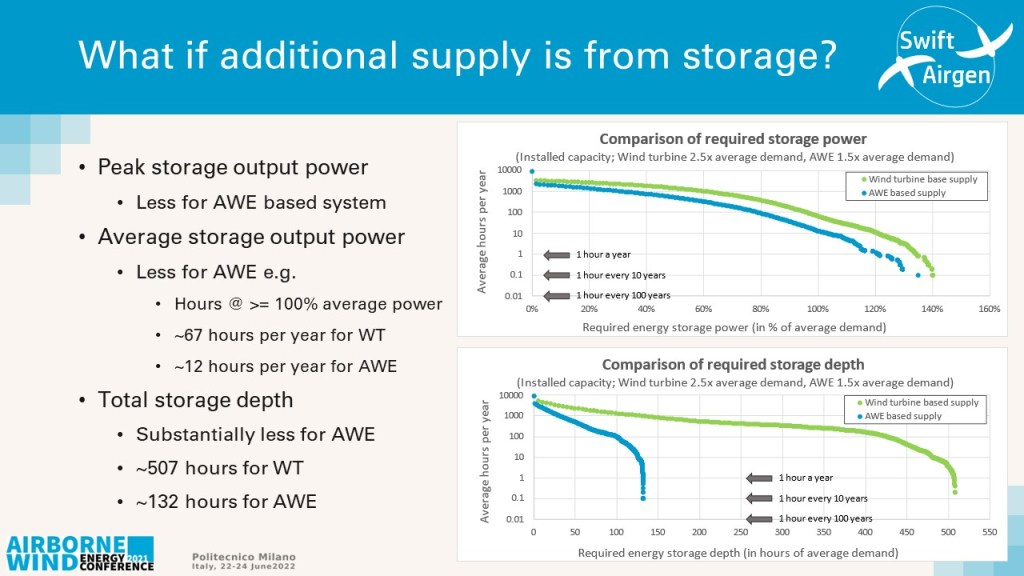
What if the other ‘additional supply’ was all from storage that is itself charged by excess supply from wind.
What would the instantaneous storage peak supply requirements be and what would the depth of the storage system need to be? The charts show the required characteristics of this storage supply system.
The top chart shows the average number of hours per year where the storage supply must be able to provide at least a given power. For example, it shows that the storage system must be able to provide at least 100% of the average annual demand power for 67 hours per year for the wind turbine system verses only for 12 hours per year for the AWE system.
The lower chart shows the average number of hours per year where the depth of the storage supply must be at least a given volume, shown in this chart in terms of hours of average annual demand. For example, for the wind turbine system the storage must have at least 100 hours of depth for over 1000 hours of each year whereas the airborne wind energy system only requires that storage depth for around 100 hours a year.
Importantly to provide assured supply the total storage depth for a wind turbine-based system would need to be in excess of 500 hours average demand whereas for the airborne wind energy system it would only need to be 132 hours in depth. This is to be confident of the storage depth not falling to zero charge more often than 1 hour per 100 years.
So, what does all this mean, what is the message?
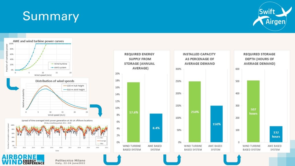
I have shown that a airborne wind energy power curve with higher efficiency at lower wind speeds results in a significant reduction in power generation fluctuations.
I have shown that this then reduces the demands and requirements on the power balancing system. In fact, the overall installed capacities can be much less for airborne wind energy, as summarised in the bar charts.
The required energy to be supplied by the storage system is reduced by a factor of 2.
The required installed wind capacity falls from 250% to 150% of average demand.
Finally, the required storage depth is reduced by a factor of almost 4 times.
As a result, the overall installation capacity and costs for this renewable generation system are significantly less for an airborne wind energy based system compared to a wind turbine based supply system.
As such airborne wind energy can provide a strategic benefit to an economy’s Net Zero power generation.